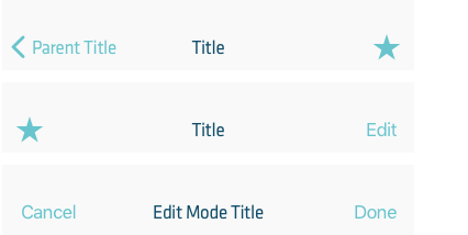
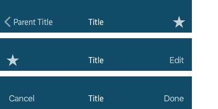
A navigation bar appears at the top of an app screen, below the status bar, and enables navigation through a series of hierarchical screens. The right side of a navigation bar contains a control, like an Edit or a Done button, for managing the content within the active view. Navigation bars are translucent, may have a background tint, and can be configured to hide when the keyboard is onscreen, a gesture occurs, or a view resizes.
Navigation Bars
Titles
Find below the default z-axis positions and styles used for the Nets UI elements found in the Digital Guidelines. These helps to signify state, purpose and relation between elements and thus help the users understand the interface better.
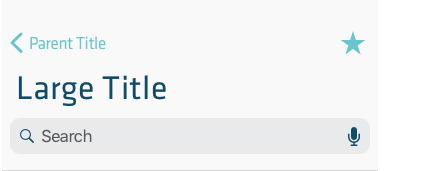
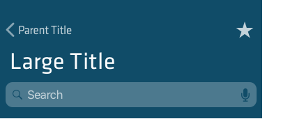
Use a large title when you need to provide extra emphasis on context. A large title transitions to a standard title as the user begins scrolling content.
Controls
- Avoid crowding a navigation bar with too many controls. If you use a segmented control in the navigation bar, the bar shouldn’t include a title or any controls other than the segmented control.
- Use the standard back button.
- Don’t include multisegment breadcrumb paths.
- Give text-titled buttons enough room. If your navigation bar includes multiple text buttons, the text of those buttons may appear to run together, making the buttons indistinguishable. Add separation by inserting a fixed space item between the buttons.


