Tab bars appear at the bottom of an app screen and provides the ability to quickly switch between different sections of an app. Tab bars are translucent, may have a background tint, maintain the same height in all screen orientations, and are hidden when a keyboard is displayed. If some tabs can’t be displayed due to limited horizontal space, the final visible tab becomes a More tab, which reveals the additional tabs in a list on a separate screen.
Tab Bars
Simple Tabs
- Use a tab bar to organize information at the app level.
- Use a tab bar strictly for navigation. Tab bar buttons should not be used to perform actions.
- Avoid having too many tabs. Use a maximum of 5 tabs. If the number of tabs exceeds 5, then the last one becomes a more button which will display the rest of the tabs ina list.
Tabs With More
When the number of tabs exceeds 5, then the last one becomes a more button which will display the rest of the tabs ina list.
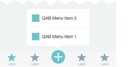
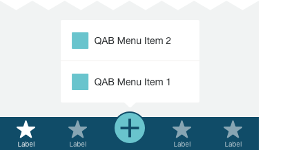
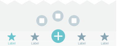
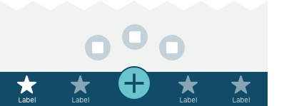
Tabs With Quick Action
Quick Action to be used when the application requires a call to action.
Normal state
Active / List
Active / Icons


