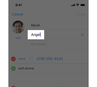
A text field is a single-line, fixed-height field, often with rounded corners, that automatically brings up a keyboard when the user taps it. Use a text field to request a small amount of information, such as an email address.
Text fields
Guidelines
- Show a hint in a text field to help communicate purpose. A text field can contain placeholder text—such as "Email" or "Password"—when there’s no other text in the field. Don’t use a separate label to describe a text field when placeholder text is sufficient.
- Display a Clear button in the right end of a text field when appropriate. When this element is present, tapping it clears the contents of the text field, eliminating the need to keep tapping the Delete key.
- Use secure text fields when appropriate. Always use a secure text field when your app asks for sensitive data, such as a password.
- Use images and buttons to provide clarity and functionality in text fields. You can display custom images in the left or right sides of a text field, or you can add a system-provided button, such as the Bookmarks button. In general, use the left end of a text field to indicate a field’s purpose and the right end to indicate the presence of additional features, such as bookmarking.
