Collapsible container, best used for small bits of content such as setting changing or other types of UI blocks.
Accordions (Expansion panels)
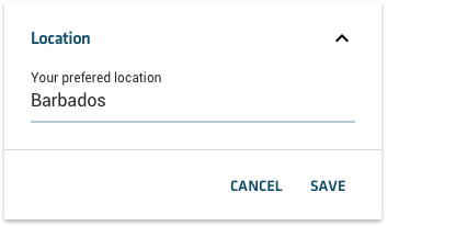
For editing
Animated transition to expanded state. Buttons always on the right, with positive action always on the right, to facilitate one handed use of the app.


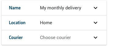
For creation flows
Basically a vertical list of simple expansion panels, separated by a standard divider but part
of the same sheet of material.
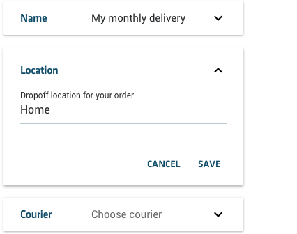
Expansion of an individual panel is animated and breaks material sheet.
Recommendation : expanding a panel closes any previously opened panel (if available) if a direct
comparison between the 2 panels in question is not necessary (which it shouldn’t, if you are
using this component).

