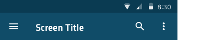
Toolbar that’s used for branding, navigation, search, and actions. Icons on the right side of the app bar (if available) shoud be app-related actions. The menu icon (if present) opens the overflow menu, which contains secondary actions and menu items like help, settings, and feedback.
Regular App Bar
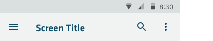
Default
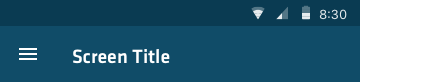
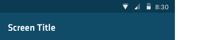
No navigation
Only use when screen is temporary and is supposed to be a one time visit that does not have the ability to navigate away by general navigation. (For example, this would be fitting for a page displaying content of a push notification for a particular payment without requiring the user to login).
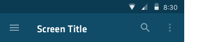
With icons
The hamburger menu opens the navigaton drawer. It can also be replaced with an “Up” action, to
navigate through app hierarchy.
The menu icon opens the overflow menu, which contains secondary actions and menu items like
help, settings, and feedback.
Icon(s) on the right side of the app bar are app-related actions.
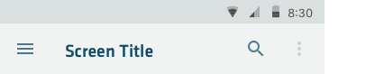
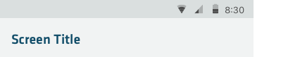
With icons off-color
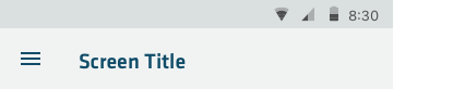
Use when more emphasis on title is required.
Also, any icon can also be disabled in the App bar (see menu icon on the right).