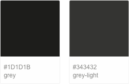
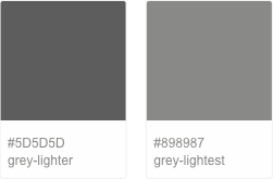
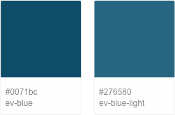
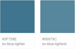
Nets Digital Products use colors purposefully in order to communicate the functions in the interface. The reasoning for this is that it helps fundament visual patterns that make any interaction easier and more predictable by creating patterns and visual cues.
Colors
Main colors
In the Nets digital universe, color is used sparingly to draw attention to important elements and those that we want the user to take action on. As such, the main interface color is grey, being displayed most frequently across our products. The Evening Blue is used primarily to accent certain parts of the interface, such as buttons, text buttons, progress bars, selection controls, sliders and headlines. Because most of the interface is gray, pops of color catch a user’s eye. You can extend any of our colors by blending with white, creating tones incremented by 10% that help you show division between different parts of the interface. This is applicable for both our main and our secondary colors.
Secondary colors
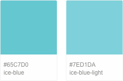
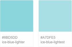
The secondary colors are used to highlight certain elements of the interface you are designing. They contrast with the surrounding UI elements and need to be applied sparringly. Using a secondary color is optional if you manage to build the interface colors centered around the main colors. Ensure that you do not use Ice Blue as a text color on white background, or as a background color for white text, because it does not meet our accesibility requirements explained below.
Support colors
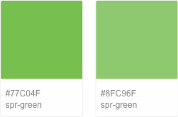
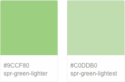
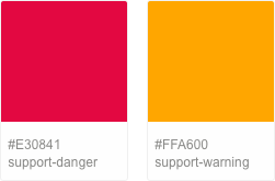
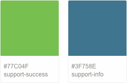
Support colors are used to bring to attention certain states with primary importance, that appear rarely and should be distinct from other elements. For example, use support colors when displaying errors, warnings or when announcing success. As in the case of secondary colors, special colors should be applied with restraint to interface elements.
Accesibility
Nets digital products be built with consideration for our merchants and clients who have vision problems. As such, colors must meet the minimum contrast ratios that the WCAG 2.0 specifies for text and background color combinations. WCAG 2.0 level AA requires a contrast ratio of 4.5:1 for normal text and 3:1 for large text. Level AAA requires a contrast ratio of 7:1 for normal text and 4.5:1 for large text. Large text is defined as 14 point (typically 18.66px) and bold or larger, or 18 point (typically 24px) or larger. You can read more about the WCAG Guidelines here. Adhering to these standards helps our users who are colorblind or have low vision to better interact with our products, and also ensure better overall usability and readability. All UI elements present in the Nets Digital Styleguide are all vetted to pass the minimum contrast ratios. If you need to create your own custom UI elements we recommend to test your contrast ratios so they adhere to accesibility standards. For testing, we recommend WebAIM’s Color Contrast Checker, or installing Stark plugin for Sketch, which allows you to check contrast ratios while in the design software.

More info
If you need to create illustrations for your products you are allowed to use any colors from our Nets Brand Guideline, which can be accessed here. There you can also read more about our brand colors, our rationale for using them and more detailed explanations.
