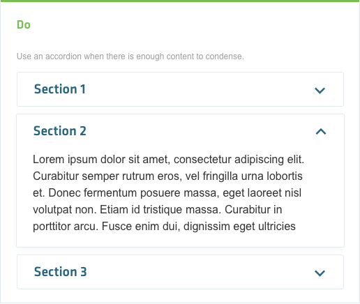
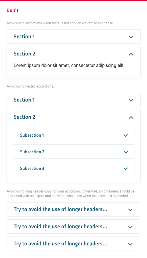
An accordion allows a user to expand and collapse the display of a sections of content on a page. They are best used when vertical space is limited or when users require a specific area of content within the page.
Accordion
Default accordion
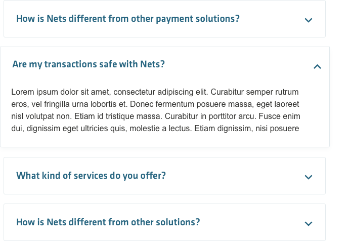
In its default layout, the accordion contains multiple sections of content, each represented by a header and an interaction icon. When clicking or tapping anywhere in the header area, the section expands and displays the content below. Multiple sections of the accordion can be opened at the same time.
The heading label of the accordion needs to be set with a color that signifies that it can be interactioned with. If a section is expanded, the bounding box of the slightly grows in size and the interaction arrow changes its form to a reversed one.

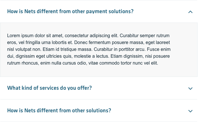
Borderless accordion
As an alternative accordion styling, you can use a borderless layout for section headers and bordered content for expanded sections.


