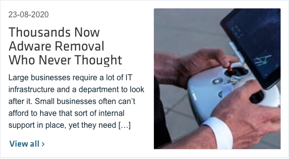
Cards are used to apply a container around a related grouping of information. They provide an at-a glance preview and contain easily consumable content. This pattern is best utilized when showcasing a collection of similar items.
Cards
Dashboard card
Cards for a dashboard-type interface can be as minimal as having a title with an icon and description or can be more detailed to include a chart, live metrics, or metadata.
If the title of the card is too long to fit the allocated space, you can shorten it with an ellipsis and display it in full on hover. The action button on the right should never be shortened, in order to clearly express the action it does.
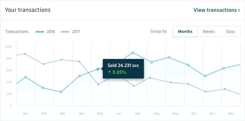
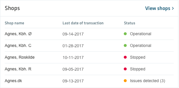
Photo card
