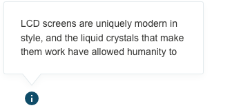
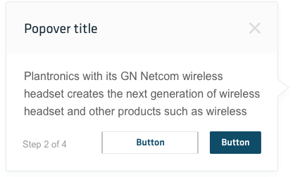
Messages consist of an icon revealed when a user hovers or clicks on an icon. Their main use is alerting a user to a required action or important information.
Tooltips & Popovers
Default tooltips
The error summary must be placed at the top of the page, so it is guaranteed to take the user’s attention at first glance when entering the page or refreshing. They can present a clickable region that will prompt a detailed explanation of the error with additional information and can be dismissed via a close button or an X icon.

