Use buttons and links to trigger actions. Buttons can contain a combination of a clear label and an icon while links are always text.
Buttons
Button variations
These variations can be used for all button types. For consistency and uniformity across products, for button groups, choose a single button variation and do not mix them.

The most general use case for buttons - solid fill and label.

Use when you want to draw more attention to the button, or when an icon helps to convey more meaning.

Icon only - Use when space is constrained and the function of the button is obvious. A button with a label is preferred over this approach.

Use when a toolbar or standard buttons would draw attention away from more important content. It is often used at the top of a page or section and must use an icon and label.

Use when a toolbar or standard buttons would draw attention away from more important content. It is often used at the top of a page or section and must use an icon and label.

Use when another action has to be completed before the button is usable, like changing a field value or waiting for a system response. Use only with primary and standard button types.

Use grouped buttons when there is a close relationship between a number of buttons. This patterns is normally used at the top of the page (see the section below).
Sizing & Typography
Button sizing needs to be decided based on button priority, position on the page and scaling with the rest of the UI elements in your design. Find below examples of scaling:
Small Buttons
padding bottom & top: 6pt
padding left & right: 16pt
height: 32pt
—
font-family: Klavika
font-size: 14pt
font-weight: 500
line-height: 20pt

Medium Buttons
padding bottom & top: 8pt
padding left & right: 32pt
height: 40pt
—
font-family: Klavika
font-size: 16pt
font-weight: 500
line-height: 24pt

Large buttons
padding bottom & top: 12pt
padding left & right: 32pt
height: 48pt
—
font-family: Klavika
font-size: 16pt
font-weight: 500
line-height: 24pt

Button states
Primary button - Evening blue


Primary button - Grey


Secondary button - Ice blue


Secondary button - Border


Secondary button - Light border


Sorting buttons
When you have multiple types of buttons in the same interface, they should be sorted by importance, from left to right.

Best practices for writing labels
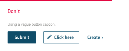
Button labels should be in sentence case. Button labels should be as short as possible, while clearly explaining what happens when the button is pressed. Avoid longer texts on a button and generic or undescriptive text such as “click here”, “submit”, etc.


Button groups
Grouped buttons give users access to frequently performed, related actions.


Responsive button groups
Sometimes due to space constrains, all the buttons might not be able to be shown. In this case, the buttons will collapse behind a drop menu with a ‘more’ icon.

