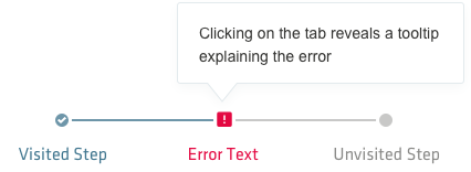
Progress indicators, or trackers, guide users through steps that take place on multiple stages or screen. It lets your users know where they are in the process and it can also be used for navigation if the steps are selectable.
Progress indicators
Guidelines
The progress tracker is composed of a progress bar, that displays the progress towards completing the task as differences in shade of color. The task itself is split into stages that are marked on the progress bar. The stages have different styling depending on their three states: current, visited, and unvisited. Follow these guidelines for building progress indicators:
- Progress indicator labels need to clearly indicate the purpose of the step. When writing labels, Use labels that clearly indicate the purpose of the step. When writing, keep options to a single line of text, be short and concise (1-2 words).
- If a task needs more than 6 steps, consider simplifying the process or breaking it up into multiple tasks.

Error notifications
When one of the steps of the task has an error, you can indicate this by replacing the normal step marker with an error icon. This is accompanied by a tooltip explaining the error, which can be shown automatically when reaching that step or it can be activated on interacting with the icon.
When writing the error details, follow the generally applicable guidelines you would use for any such text - provide context, make the instructions as concise and clear as possible, make sure doing the task outlined in the instructions is as easy as possible, don’t place blame on the user.
