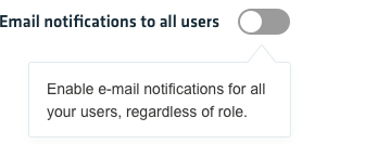
Toggles allow users to quickly view and turning something on or off, switching between enabled and disabled states. While checkboxes and radio buttons are used for making a selection between multiple options, the toggle enables or disables an option.
Toggles
Guidelines
As a rule of thumb, use a toggle if the action you need your user to perform could be performed with a physical switch. Otherwise, consider using other, more viable options depending on your situation.

Tooltips
You can use a tooltip on hover to explain to the user the result of changing the toggle status. When writing these tooltips that are clear and concise, otherwise you risk confusing the user more so then helping him.

Toggle states
Active

Focus

Inactive

Disabled
