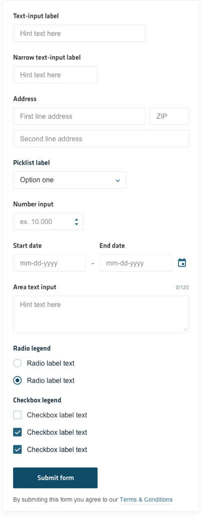
Input fields allow people to enter any combination of letters, numbers, or symbols of their choosing (unless otherwise restricted). Input fields can span single or multiple lines.
Input Fields
Guidelines
Ideally, you should keep your forms as simple as possible, only asking your users for the info you absolutely need to help achieve your business goals. Follow along with these guidelines to help with a better completion rate of your forms:
- Input field widths should be proportional to the length of input they take. This allows users to differentiate between the nature of the information intended in each field when scanning the form, helping with a quicker completion rate.
- All input fields should have labels, which should never be hidden.
- Input field labels should be aligned above their corresponding fields.
- Labels should be short, direct and in sentence case. Avoid a full stop at the end of labels.
- Ensure form elements have enough spacing between them.
- Only ask for the information you absolutely need. If you do find the need to ask for optional information, mark the labels pertaining to those fields as optional. Avoid marking mandatory fields with an asterisk.
- Never use a single-row input field for data that requires multiple lines of text. Use a text area input field instead, but taking care that the height of the text are is proportional to the amount of text to be entered.
- Make sure users can enter information in the form at a smaller screen size. This includes making form fields 100% width at smaller screen sizes.

Input field states
Default

Active

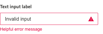
Error

Success

Area text

Disabled
