Text is the primary way that users digest content and accomplish work, so it’s important to use good typographic principles to establish a clear visual hierarchy and to maximize legibility.
Typography
Headings
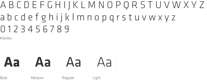
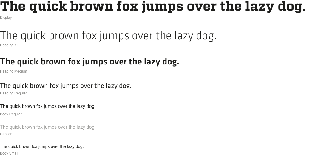
For Nets Digital Products, the headline font should always be Klavika, in medium or light weight. Klavika is a professional, modern, typeface coming in four weights. Headings in Nets Digital products should always be in sentence case. Obtain a license in order to use Klavika in your projects at the following link
Display
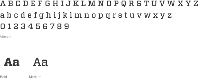
As a display font, use Vitesse when you need elements that make a bold visual statement, elements that create an impact especially in visual storytelling. For example, Vitesse use is reserved for the headline on the homepage slider or as a page title. Use Vitesse in bold or medium weight. Obtain a license in order to use Vitesse in your projects at the following link
Body
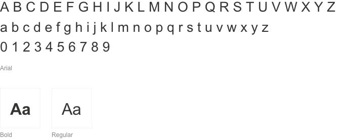
For body copy, captions, simple data in tables we use Arial Regular. In addition, Arial Bold can be used in order to provide emphasis in certain situations, to help to differentiate between smaller-scale type hierarchies. Avoid using bold and italics excessively as that can lead to a lack of hierarchizing and might impact readability.
If the situation requires it, use a bigger option of Arial regular as a Lead paragraph. Keep in mind there should only be one leading paragraph per page.
Links
Use link text-formatting when you are linking a few words of text, or when a link is standalone. Unless otherwise specified in your particular project, hyperlinks should use color #3F758E and should use a dotted underline of the same color.
On hover, the dotted underline transforms into a solid 1px line, and both the underline and the text should use the color #56879C.
For a hyperlink that was already visited by the user, the text color should change into #205493.
In the case of an external link, that takes the user outside of the Nets product, you can add an icon to right of the link text, while keeping the rest of the formatting the same.

Hierarchy
Aim to create a clear and logical type hierarchy, through text sizes, styles and spacing. This ensures that the UI elements are clear and easily recognizable for your users, creating familiarity. While creating type hierarchy, keep in mind the need to balance content density and reading comfort.
Once the sizing hierarchy is established, if two pieces of text have different positions in the content hierarchy, you can use color to emphasize, or de-emphasize, one of them. Content that is de-emphasized allows the eye to focus on core elements while scanning the page, improving usability.
Text treatments
You can make use of different techniques to make text easier to read, emphasize or subdue content depending on the situation.
Bulleted list
Make use of a bulleted list to organize text. If you do so, please make sure the following guidelines are respected:
- use a lead-in line before the bullet list
- each bullet’s text needs to make sense when read along with the lead-in line
- use lower case at the start of each bullet
- don’t insert more than one sentence per bullet point - if you need to expand an item a comma or dash
- don’t put ‘or’ or ‘and’ after the bullets
- links should appear within the text and not as the whole bullet
- don’t put a semicolon at the end of a bullet
- don’t put a full stop at the end of the last bullet
Numbered list
Use a numbered list instead of bullet points in situations such as explaining a process or a set of steps.
- You don’t need a lead-in line and you can use links and downloads (with appropriate Markdown) in steps.
- Every item needs to be a complete sentence, ending in a full stop.
Inset text
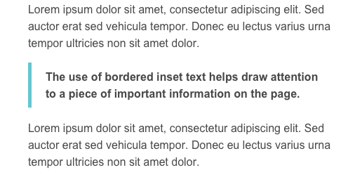
In the context of a text-heavy page, bordered inset text can be used to draw attention to important content within a block of text.
