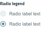
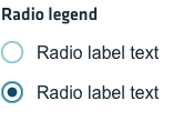
Use a radio button list when you want a user to select a single option from a list of visible options. For example you might use this if you need to pick a single type of permissions from a list of possible permissions for an account.
Radio Buttons
Guidelines
Use radio buttons to describe complex choices to your user, providing all the available options in clear view, next to each other. Keep in mind the following list of best practices when creating a radio button list:
- List the choices in a logical option, starting with the ones most likely to be selected, simplest to most complex and least to most risk. Avoid sorting in alphabetical order.
- Labels for each choice need to be concise and provide context. Make sure the choices you are describing do not clash with each other. Avoid overlapping choices (ex: 0-10 and 10-20, if the user needs to pick 10) or incomprehensible choices (ex: below 10 and above 10 if the user needs to pick 10).
- Select the safest and most secure choice from your dropdown as the default option. Be careful when setting a default value, as it can discourage users who don’t fit into what you assumed was their profile. If you are in doubts, don’t select any value by default.
- For an unselected state, add a radio button with a “none” choice.
- If your radio-button list cannot contain all the possible choices, consider adding an “other” choice.
- For more than two choices, options should be listed vertically, horizontal listings can make it difficult to tell which label pertains to which radio button.
- If you have a large number of choices, consider using a dropdown menu instead.
- Both the text and the checkbox itself should be tappable or clickable by the user to select or deselect an option.
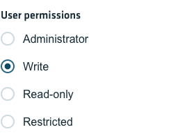
Radio button states
Active
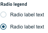
Hover
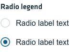
Focus
Disabled
