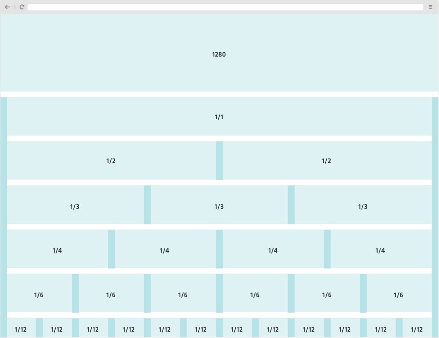
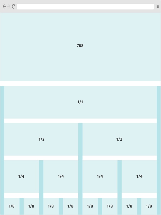
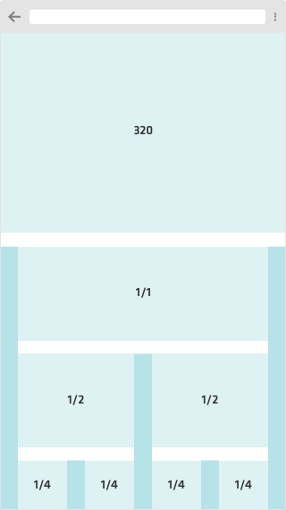
Make use of a vertical grid to lay out your content, as it provides a flexible and width-agnostic scaffolding system. The grid divides horizontal space into columns, and each column has a width specified as a proportion of the total available page width.
Columns are separated by white space areas defined as gutters, which remain a constant size regardless of the total width of the page or the number of rows. When designing, start with small screens first and afterwards adapt toward bigger resolution screens.


