Notifications inform the user of important changes, offering feedback or confirmation, and generally appear at the top of the page.
Notifications
Guidelines
Notifications must generally be placed at the top of the page, so they will catch the user’s attention at first glance when entering the page or refreshing. They can present a clickable region that will prompt a detailed explanation of the error with additional information and can be dismissed via a close button or an X icon. Find below a list of general guidelines for notifications:
- When the user is required to respond to the alert with an action, give him instructions via the alert text and try to make doing the task itself as easy as possible.
- Provide the necessary context in the instructions, so the user knows what to do, but is not overwhelmed with information.
- Instructions should be concise, in readable language, avoiding jargon or code. Avoid placing the blame on the user through your message.
- Error instructions can be a chance to provide the user with educational material as to not repeat the error, keeping in mind that users don’t generally read documentation beforehand.
- Avoid having too many notifications, as they can overwhelm or annoy the user and will be ignored.
- Allow dismissal of notification whenever appropriate.

Notification types
The error summary must be placed at the top of the page, so it is guaranteed to take the user’s attention at first glance when entering the page or refreshing. They can present a clickable region that will prompt a detailed explanation of the error with additional information and can be dismissed via a close button or an X icon.
Info notification
Use inline notifications for advisory information for the user, that is not important enough to justify a notification or alert. These don’t need to be placed at the top of the page, they can be placed as to correspond to the content they refer to.


Error notification
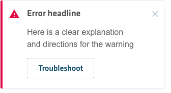
Use inline notifications for advisory information for the user, that is not important enough to justify an error notification or alert.


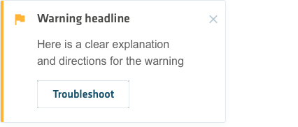
Warning notification
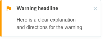
Notification layout for warnings, bringing certain aspects in the attention of the user.


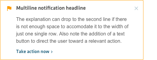
Multiline notification
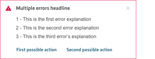
When you need to include an extended informative section about the error, which would not fit in the standard format of notifications.
Toast notification
Toast notifications are geenerally event driven and serve for confirmations, alerts and acknowledgments, generally requiring minimal user interaction. These generally appear at the bottom left of the screen, overlayed on the content.

Colors
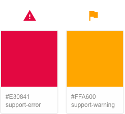
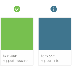
Notifications should have appropriate colors and icons, which can help indicate its content and its urgency level. This helps users scanning the page to quickly understand immediately what sort of message they are getting and prepare their response.
