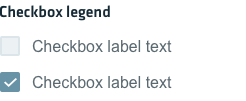
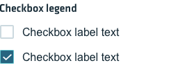
Checkboxes are used to allow users to select any number of options, including zero, from a visible list.
Checkboxes
Guidelines
Use checkboxes when selecting any number of choices from a list, when a user needs to choose “yes” or “no” on one option (like toggling something on or off) and when the user needs to select something at a glance. Find below some guidelines on using checkboxes:
- Both the text and the checkbox itself should be tappable or clickable by the user to select or deselect an option.
- Options should be listed vertically, horizontal listings can make it difficult to tell which label pertains to which checkbox.
- Make it clear when users can select multiple options from the checkbox list.
- Labels should use sentence capitalization
- Avoid using words such as “enable” in your checkbox, as that is already implied in the nature of the checkbox.
- Use positive and active wording for the checkbox labels, as it will make clear what will happen when the checkboxes are turned on. Using negative language in labels as they can be counterintuitive. For example, “I want to unsubscribe” is preferable to “I don’t want to receive promotional email.”
- If you customize, make sure selections are adequately spaced for touch screens.
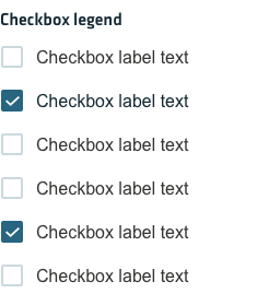
Checkbox states
Active
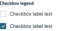
Hover
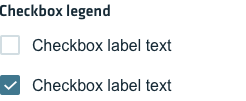
Focus
Disabled
